

Data-Driven Decision-Making – Simplified

Tailored to Meet Your Business Needs

Ongoing, Real-Time Data Analysis

Pre-Built Dashboards
Our pre-built dashboards address broadly applicable business needs. For example, common HR use cases include key metrics like headcount demographics, hiring rates, and employee turnover.
Custom Dashboards
Tailored to your specific business goals, our custom dashboards are purpose-built to answer your unique business questions or display data in a way that aligns with your organization’s goals.
Dashboard Collections
Our dashboard collections offer high-level overviews of key metrics and individual pages with drill-down views for more detailed analysis across business categories, such as Revenue Analysis.
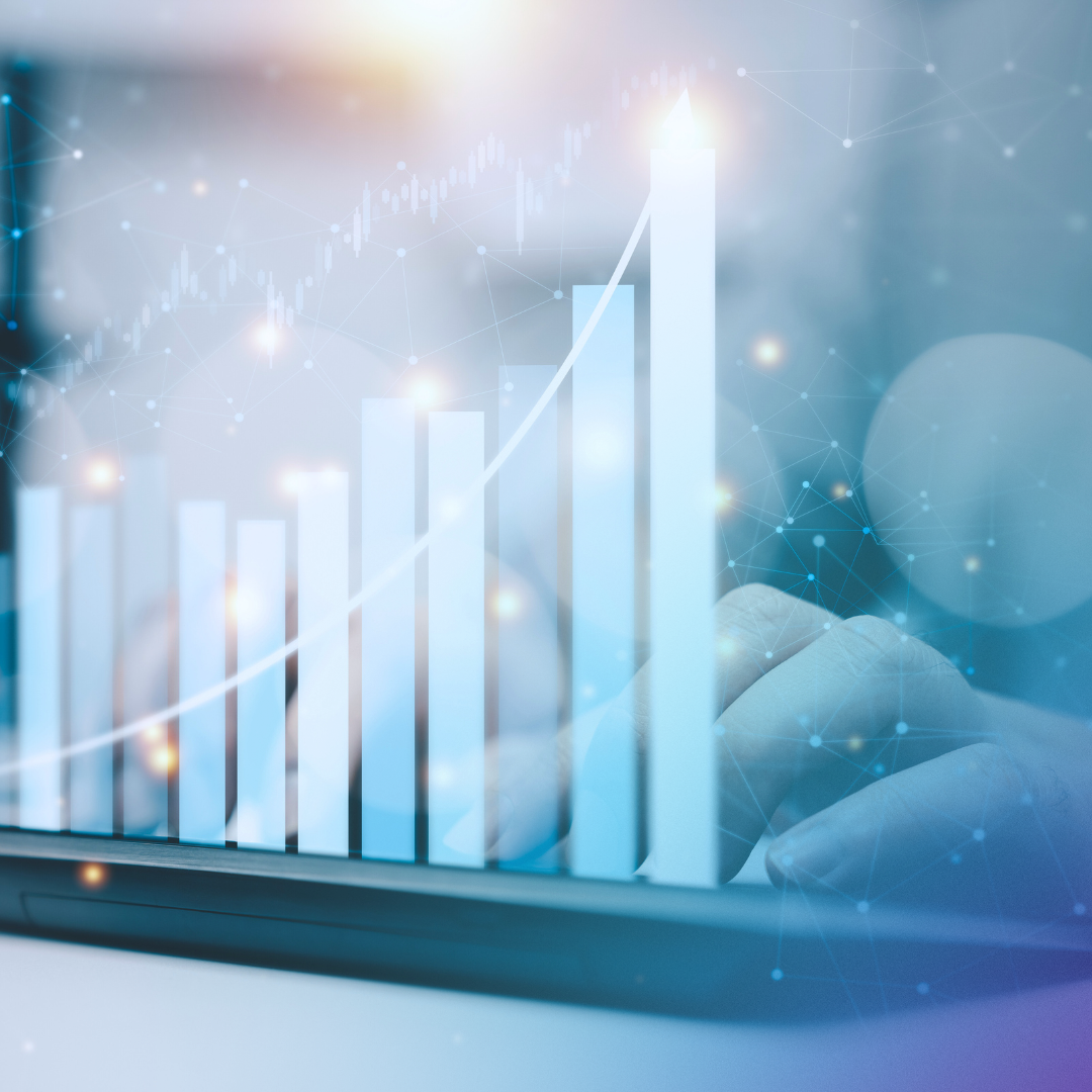
Data visualization enables…
And more.
Data visualizations leverage the brain’s ability to process visual information faster and more effectively than raw data in spreadsheets. We are naturally wired to recognize patterns, trends, and outliers in visual formats, which makes it easier to grasp complex information at a glance, leading to quicker insights and more efficient decision-making.
infoFluency offers done-for-you data preparation

We speak your language.
infoFluency translates complex analysis and technical jargon into business terms and actionable insights.

We connect your platforms.
We are software agnostic. Our data visualization dashboards connect the dots – no matter which platforms your data lives in.
We offer custom insights.
When you max out your pre-built options, we offer bespoke solutions to visualize custom calculations.

Consolidating Complex Data Sets
Data visualization dashboards allowed this client to analyze which services were most profitable and answer questions like, “What’s the breaking point profitability based on how many services we have to offer?” After analyzing the data in a visual format, they were able to make profitability decisions faster and easier.
Ready to visualize your data?
Let’s transform your complex data into clear, easy-to-understand visualizations that drive action.

Assess
Understanding your business needs.

Collect
Preparing your data for visualization.

Design
Building visualizations aligned with your goals.
Customize
Tailoring your dashboards.